Are you struggling to select the perfect colors for your gift certificate? You’re not alone. Color choice can make or break your design, affecting how your gift certificate is perceived and valued. In this comprehensive guide, we’ll walk you through the process of choosing colors that will make your gift certificates stand out and impress both givers and recipients.
Why Color Matters in Gift Certificate Design
Color is more than just aesthetics; it’s a powerful communication tool. The right color palette can:
Reflect your brand identity
Evoke specific emotions
Enhance readability and usability
Increase perceived value of the gift

Understanding Color Psychology for Gift Certificates
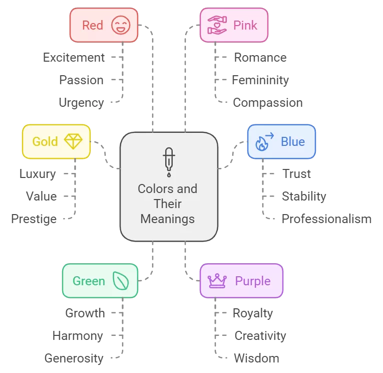
Different colors evoke different emotions and associations. Here’s a quick rundown:
– Gold: Luxury, value, prestige
– Blue: Trust, stability, professionalism
– Green: Growth, harmony, generosity
– Purple: Royalty, creativity, wisdom
– Red: Excitement, passion, urgency
– Pink: Romance, femininity, compassion
Consider the purpose of your gift certificate when choosing your color scheme. A spa gift certificate might use calming blues and greens, while a high-end restaurant could opt for elegant gold and deep purple.

Color Harmony Techniques for Gift Certificates
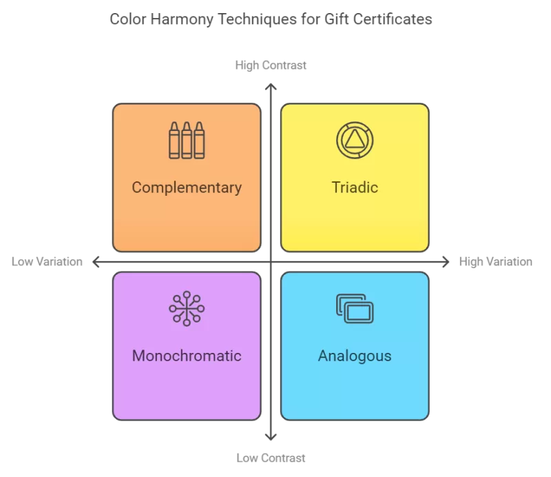
To create a visually appealing gift certificate, consider these color harmony techniques:
- Monochromatic: Use different shades and tints of one color for a sophisticated look.
- Complementary: Choose colors opposite each other on the color wheel for high contrast and impact.
- Analogous: Select colors next to each other on the color wheel for a harmonious, cohesive design.
- Triadic: Pick three colors equally spaced on the color wheel for a vibrant, balanced appearance.

Practical Tips for Choosing Gift Certificate Colors
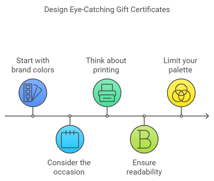
- Start with your brand colors: If you’re designing for a specific business, begin with their existing color palette.
- Consider the occasion: Holiday gift certificates might use seasonal colors, while wedding gift certificates could incorporate romantic hues.
- Think about printing: Some colors may not print as expected. Always do a test print before finalizing your design.
- Ensure readability: Use contrasting colors for text and background to make important information stand out.
- Limit your palette: Stick to 2-3 main colors plus a neutral to avoid overwhelming the design.

Tools for Choosing the Perfect Color Palette
Take advantage of these online tools to help you select and refine your color choices:
– Adobe Color: Create color schemes based on color harmony rules
– Coolors: Generate color palettes and get inspired by trending color combinations
– Canva Color Palette Generator: Upload an image to extract a matching color palette
Conclusion: Bringing It All Together
Choosing the right colors for your gift certificate design doesn’t have to be daunting. By understanding color psychology, applying color harmony techniques, and following practical tips, you can create a visually stunning gift certificate that captures attention and conveys value.
Remember, the best color choices are those that align with the brand, appeal to the target audience, and enhance the overall design of the gift certificate. Don’t be afraid to experiment with different combinations until you find the perfect palette that makes your gift certificate truly shine.
Ready to start designing? Try applying these color tips to your next gift certificate project and watch your designs come to life!
Looking for more design inspiration? Check out our gallery of beautifully designed gift certificates or start today!
